Projects.
Projects.
Projects.
Joint
ART DIRECTION / BRANDING / WEBSITE DESIGN
Joint Agency has been a passion project that has grown to see the light of day. This project has been an opportunity for me as a designer to show where my design skills and taste live with full expression.

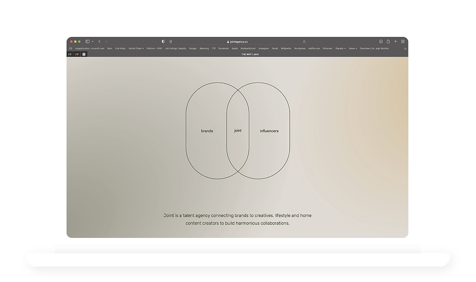
Joint is a talent agency connecting brands to creatives, lifestyle and home content creators to build harmonious collaborations.
Logo design
PRIMARY LOGO
Primary logo is bold and to the point. It has a mix of classic with the serif and modern with the color and rounded corners.
SECONDARY LOGO
Mimicking the primary logo, this one has a mix of both classic vibe with the serif font and modern touch with the pill shapes surrounding the "j".


Branding elements
BRAND COLORS
RUSTY ORANGE - tertiary color
The third color is added to bring dimension. Being a warm color, orange, brings comfort to the identity all while representing the vibrance the brand inhabits.
BRAND COLORS - USECASES
BEIGE - primary color
This color is used as the base across the brand. It is found in the background of almost everything. Beige was picked as a smoother color to white and brings tranquility.
MOSS GREEN - secondary color
Green is a color that conveys honesty which aligns with Joints mission of bringing the most honest collaborations together.
THE PILL
The Pill has been adopted as one of the strongest brand elements. It represents the collaborations between brand and influencer coming full-circle. Elongating the circle into a pill shape represents the modern side of the business and fearlessness to push boundaries.
DESIGN ELEMENTS - USE CASES

DIAGRAMS
The pill shape is extremely versatile. One of the benefits of using this shape is that we can use it in instances like this, in venn diagrams. This shape would also be possible in bar charts, scatter charts, three map chart, and even candle stick charts.
ICONOGRAPHY
Iconography is always a strong way to show brand identity. In the case for Joint, the pill has been used in an illustration manner to depict the different capabilities of the agency. "Building brand loyalty" is a perfect example of this as it shows the pill form stacked as boiling blocks.
Social media
Design elements


